I have heard so much about “data not dates” in the news these last few days that it feels like this summer will seem like things are getting back to normal. I, as I’m guessing you are, can’t wait for it. While there will be some kinks in getting used to having things as they were, there is still going to be a big change in how people work.
Working from home will be the norm now for most of us, as companies realise it works and that they don’t need to have such big offices that staff are in constantly. While that can mean you are popping into the office for a few days every week, your home office is still going to be your hub for the time being.

And if you’re getting sick to the gills staring at the same four walls every morning on that catch-up team call, maybe it’s time to get the paintbrush out and give your space a fresh lick of paint. Painting your home office can be easy, just as long as you don’t make any simple mistakes you’ll grow to hate. Just follow these do’s & don’ts of painting your home office to get started.
Do: Ditch the white emulsion
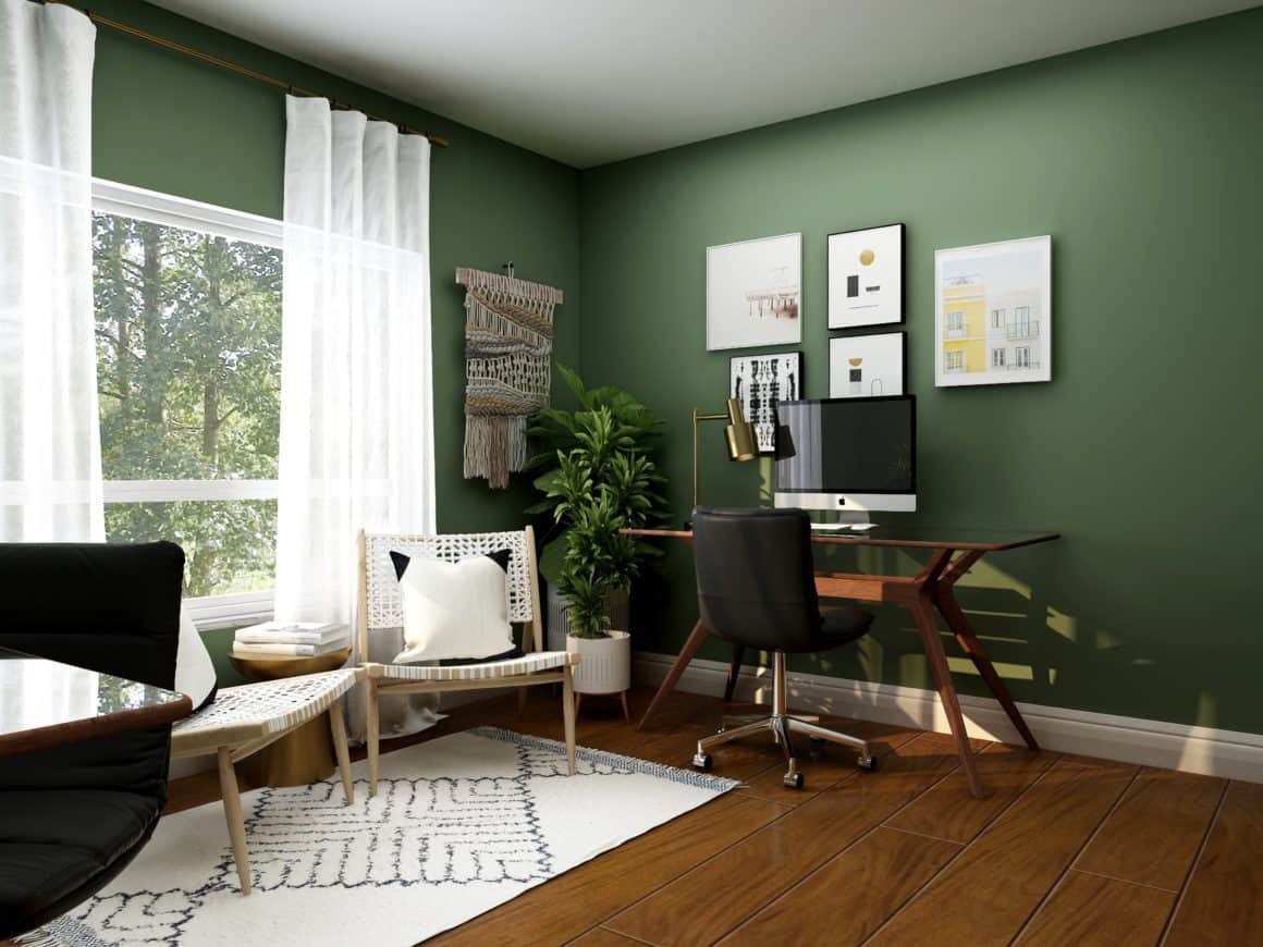
Don’t get me wrong. White can always look great on walls, but if you want your home office to feel like a different & functional space, you need to have a different colour in there. Muted tones are best, as they’re conducive to creating a calming environment. Many paint brands sell tinted versions of popular colours, which you should check out, especially with pastels, greens and blue.
Plus, if you have a small office, you’ll only need a small tub to do the job. Quids in, eh?
Don’t: Go crazy with one colour

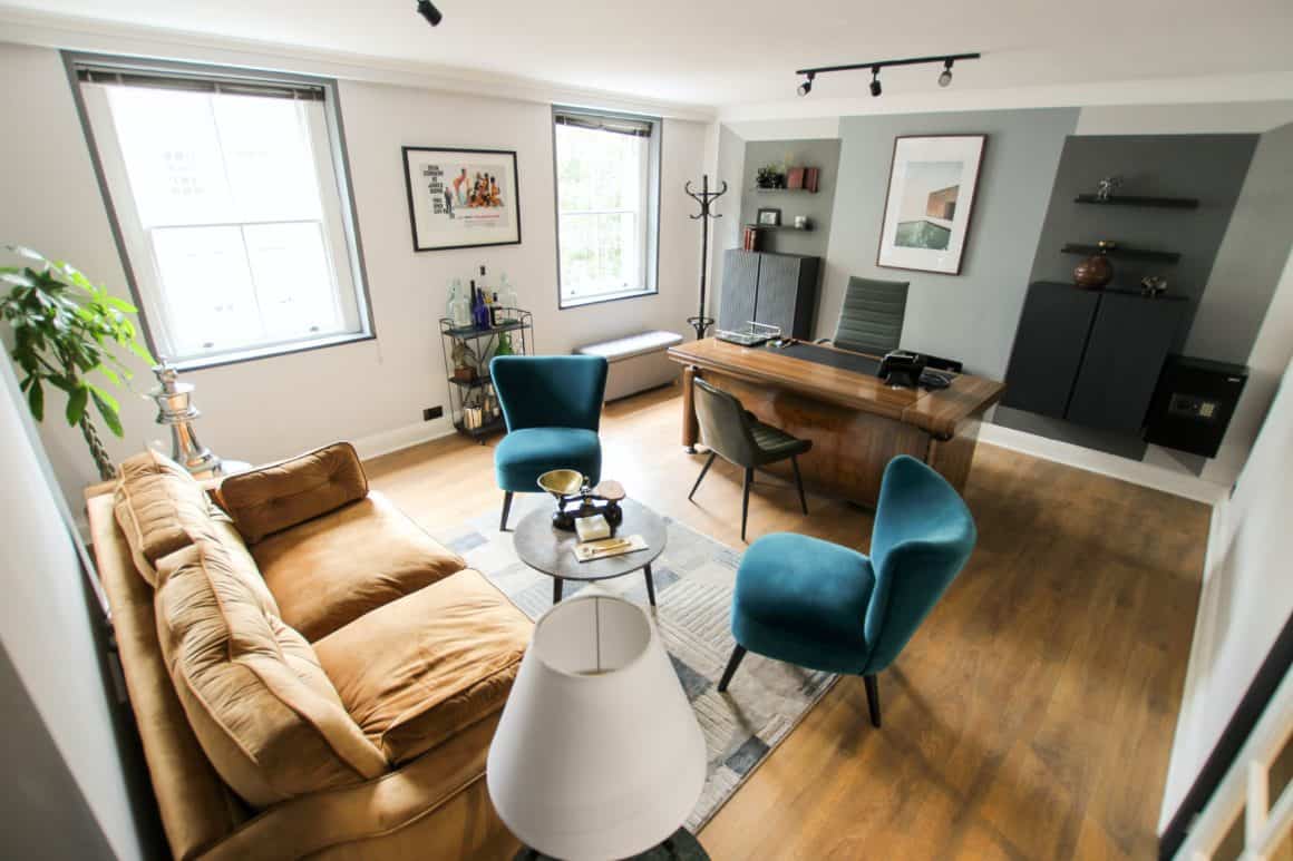
Please don’t choose bold colours and then paint the whole room with them. While bold colours help in small areas (which I’ll get to next), never paint your rooms one exciting colour. Just imagine what you’ll look like on a Zoom call with a dark red wall behind you. If you do have a more intense colour, split it up. Have it on opposing walls and use a white or light grey in between to add balance.
Do: Add pops of colour to help with size
Most home offices are teeny tiny spaces. I know many people are using their spare box bedroom as an office. Even though it’s a small room, it’s a better work environment than the kitchen table when everyone else is stuck indoors too. Adding a pop of colour here and there with paint works well. You don’t have to try and copy those intricate-looking geometric shapes people are posting on social media but think of angling different colours in an arrangement to help add the illusion of space.
Don’t: Match furniture with those pops of colour

One advantage of the home office is ditching boring old office chairs for something with a little personality. If you have a big fluffy pink chair, ergonomic blue chair, or a leather chair you love sitting in, don’t have it match your walls. It may give the illusion of shrinking a room, as loud colours on walls have nothing to contrast.
Do: Don’t be afraid of grey

Give me a dozen shades of grey, and I can show you how to make it in every room around the home. Boring old grey has been given a revamp in recent years, especially with anthracite, stone and ashy shades making their mark (The Paint Shed has some great offers on grey paint just now).
The right shade of grey will help detail your home office when used appropriately. If it’s a big room, it is fine to have on all the wall – as long as you use a matt or eggshell. If it’s a small office, use grey paint on fixtures and fittings like shelves, doors, and switches. It helps add character.
Don’t: Use gloss paints
There’s a reason we only ever tend to use gloss on skirting boards and trim. It would be something of an eyesore if you had your walls and ceiling covered in gloss. Never use it in your home office, even if it gets a lot of natural light. Come those darker months where you need all the lights on while you work; it can become an eyesore.
That’s pretty much all the do’s & don’ts of working with paint covered. If you think of giving your home office a new look, read this recent post on designing the perfect home office.

