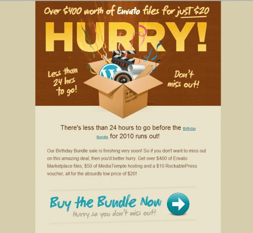
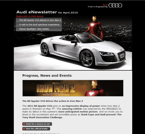
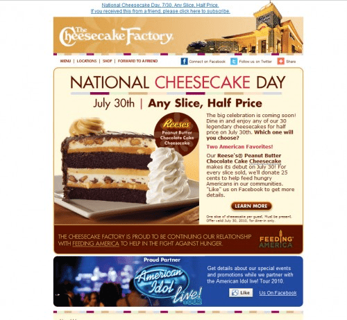
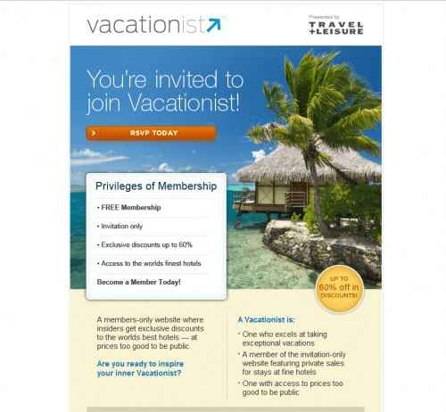
Nowadays, email marketing is an excellent way to attract new clients to any business. Of course, it’s not always easy to think up new and exciting content every day, week, and month. And needless to say, it isn’t very reassuring when you spend time developing your ideas, but your customers do not interact with the email they get from you. Poor designs cannot attract people’s attention, and as a result, you do not get a lot of responses.

Please do not be sad because we have a great decision about this problem! Our article will provide 20 excellent ideas for newsletter subscription design to keep your clients engaged. We guarantee that people will love your subscription page design. Keep reading our fantastic ideas for your subscription form design and create stunning newsletters to catch your subscribers’ attention!
1. Use contrasting colours
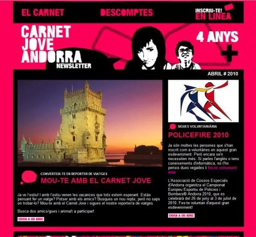
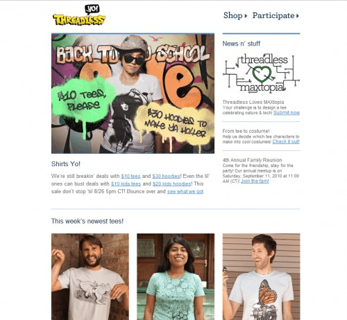
If you want to make an eye-candy email newsletter design, choose cool contrasting tones that will attract people’s attention and make your message stand out from others. Your email letter can be short and straightforward, but colours matter a lot: people are more likely to pay attention to contrasting colours. Combine bright colours with short and well-understandable text, and you will get a successful newsletter subscription design.
2. Make Sure Your Design Is Mobile-Friendly
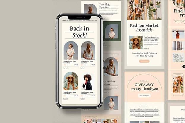
If your content isn’t optimized for mobile phones, people won’t be interested in it. Nowadays, most men and women read emails from their smartphones, and if your email newsletter design isn’t mobile-friendly, you will not succeed. Make sure all the images and texts are suitable for various smartphones, including Android and iOS.
3. Create Straightforward Messages
Make straightforward emails to your customers because otherwise, they will delete your letter and forget about your offer. Say clearly about things you will provide to your subscribers and create an eye-catching headline to make people read the entire email.
4. Create a Unique Design
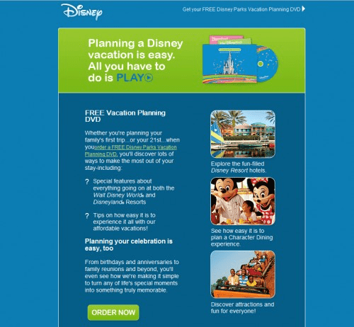
Famous brands are recognizable by their logos or even colours, and when you are making email designs, you should use your company style. It means the email design must contain the brand’s logotype, icons, colours, and more elements that characterize your company. In other words, you need to make a unique design for your newsletter emails.
You can find catchy ready-made templates on HubSpot, MailChimp, or create some with the Canva editor.
5. High-Quality Content
You should spend time and think up good content for your subscription pop-up design because it will help attract more potential customers and increase the popularity of your brand. If you are offering any product, promote perfect matches of this item with other products your company provides. We suggest defining your potential clients and then creating content to persuade these people.
6. Use a Friendly Tone
People do not like that sales-pitchy tone many companies still use. If you promote a service or a product, talk to people personally in a friendly and casual style. It will help you to attract more potential clients and increase sales. Avoid an over-promotional tone and be familiar with your customers when you are creating the subscription form design. The Grammarly service can help with it.
7. Be Creative
Needless to say, your email newsletter should be well-structured. It would help create a creative email layout that makes the whole message eye-catching and exciting to potential clients. You can experiment with colours, grids, lines, and shapes to define various promotions. This will help you to make an exciting email to catch the readers’ attention.
8. Insert Videos
Nowadays, video marketing is a powerful way to promote your brand and products to potential customers. Instead of making emails with long texts, nobody is interested in reading; you can insert a short and eye-catching video to your letter that will attract people to buy your products or services and boost your sales. This can be a message from the head of a company recorded with a screen recorder for Windows, a video unveiling a backstage life of a team, a funny greeting clip, or even a video meme.
9. Keep It Simple
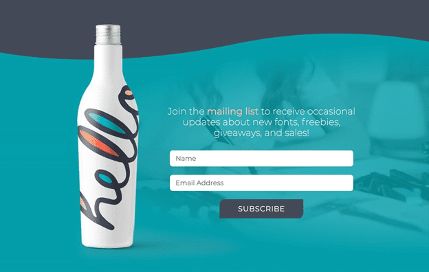
Of course, it’s also essential to keep your newsletter subscription design simple. This is an excellent way to attract clients and make them interested in reading your offers. It should be direct, straightforward, well-understandable, eye-catching, and persuasive. Keep a good balance between visuals and texts not to overload your design with anything.
10. Include a Countdown Timer
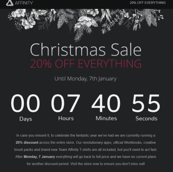
This is an excellent way to make your potential clients take action and buy something. For example, when you offer discounts, insert a countdown timer, and people will react more actively because they are limited with a special offer. Do not forget about eye-catching fonts and bold colours when writing about discounts because people like them!
11. Make Your Offers Personalized
Personalize your messages to potential clients because it will add a personal and unique touch to your emails. People feel more likely to buy something when you contact them personally to get more happy customers and successful sales!
12. Use Animation
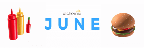
It is unique and fun to integrate some bright animations into your promotional emails. Eye-catching but straightforward things attract people’s attention effectively, and of course, it leads to more significant sales and success!
13. Tell Interesting Stories
People like to hear fascinating stories, so you should try to make your subscription page design that contains a short and bright story about your products or services. This will add a touch of uniqueness to your emails and increase the number of potential clients.
14. Include Good Illustrations
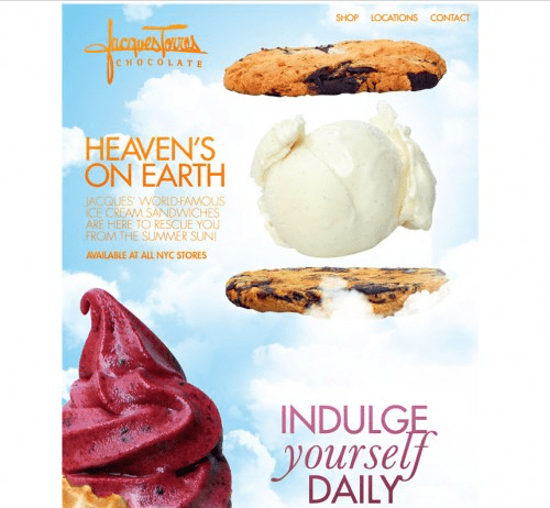
Illustrations can be a fantastic tool to attract more people and make your brand more eye-catching. You can try to include a simple illustration in your emails to make them stand out from others. Of course, you shouldn’t forget about using proper tones and techniques.
15. Include Surveys
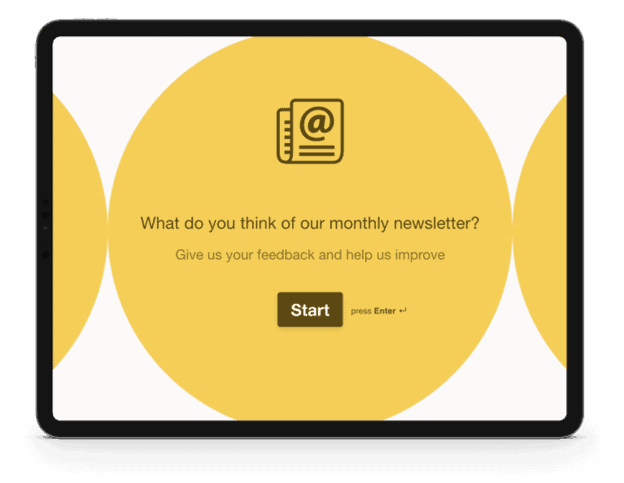
Using surveys is an excellent way to attract more customers and engage people in your company. If you’re looking to enhance your business, consider conducting an online survey for your business. Of course, not every person wants to be involved this way, but you can offer a 15% discount for taking a short survey. We promise this will help to increase sales effectively!
16. Send “Thank You” Emails
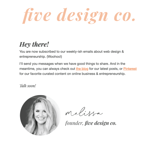
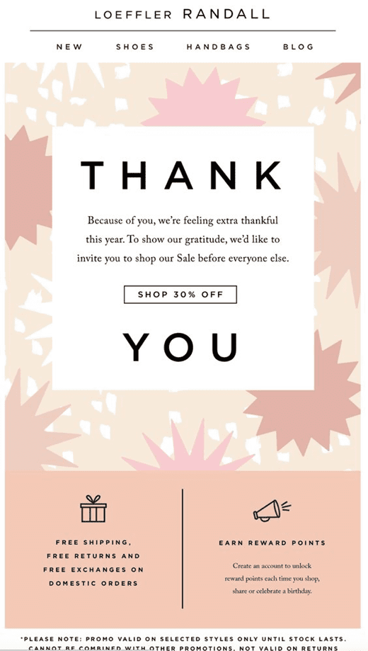
This is an effective way to show the client’s importance and show the brand’s gratitude to new clients. You should create this email in a welcoming tone and keep it short. In the email, you can make some new offers and introduce them to readers.
17. Use Colour Blocks
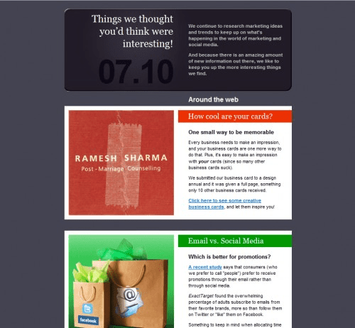
Bright and eye-catching colours make people interested in reading your emails. You can try to use colour blocks that contain short articles with CTA. This will make your emails unique and exciting to potential clients. Experiment with tones and be creative!
18. Create an Eye-Catching CTA
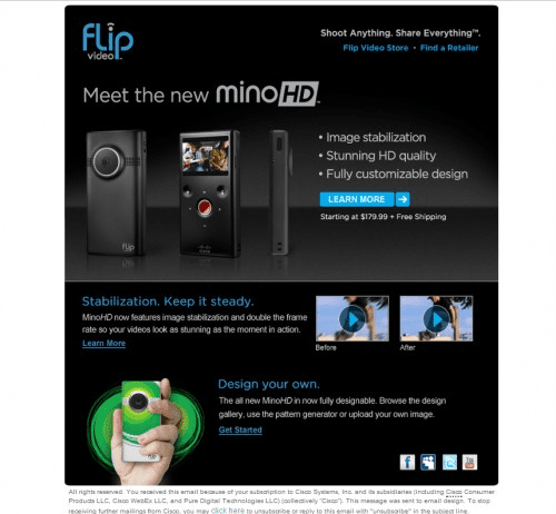
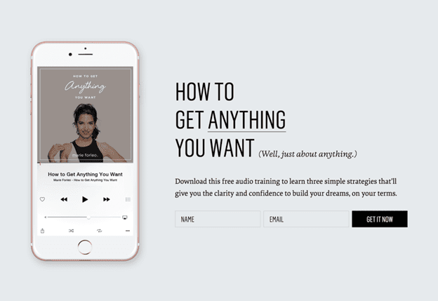
Without a CTA, your email is just an email without any goal. Sometimes, marketers create special buttons of contrasting colours. But you can do it another way: try to underline your call to action and put a chevron to stand out from other text. Experiment with the text of your CTA to avoid cliches.
19. Write Offers Directly
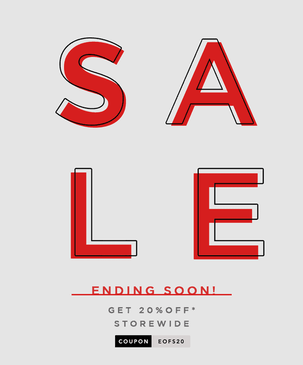
Remember that your clients do not always have time to read long texts. If you want to invite them to a sale, do it directly and shortly. Sometimes, just a word SALE written in giant letters in a bright tone is everything your customers need.
20. Create an Eye-Catching Headline
When you already make your potential customers click on the email, your next task is to make them read its content. So, you have to create an attractive headline for your email to catch the readers’ attention and make them read the whole text.
Conclusion
As for now, you have all the needed secrets of creating a successful newsletter subscription design to engage potential clients to your company. Follow the latest trends of email marketing and develop your brand using our practical hints.

Author: Alex Evans
Bio: I am a digital marketer with more than ten years of experience—a contributor to Content Marketing Institute and regularly quoted as an expert in prominent media outlets. My job is to make businesses known all over the Internet.
