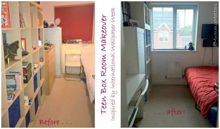
We have lived in our current home for a little over 6 years now and during that time each of the Beans has had their bedroom decorated 2-3 times. I’m a firm believer that children should be given the chance to decide how their room should look. Obviously, when they are very young it’s not so easy for them to choose but you can get indications of what they like by asking them to choose between colours/characters and themes.
Feeling Inspired
Our most recent project has been Curly’s bedroom. Did you know it was International Wallpaper Week on the 3rd – 9th October? No, we didn’t either but when we found out we were inspired to do a spot of decorating ourselves and decided to let loose with Curly’s box room. Despite being the eldest of the Beans, I’m sorry to say that he has the smallest of the bedrooms for the simple fact that he spends the least amount of time at home since he splits his time between our home and his Mum’s. Being a box room we have to be very careful about what we put in his room and how we decorate it but I’m pleased to say that we have achieved a look and layout which we are all very happy with.
International Wallpaper Week celebrates all that is great and good in the world of wallpaper. For the longest time, I stuck to just painting the walls of my home but slowly I have been creeping wallpaper into our home one room at a time and love the difference that wallpaper brings to a room. It adds more than a colour, it sets the theme and tone of a room.
Put the teen in charge
Giving children the chance to design their room themselves will make them feel more relaxed in their surroundings and take away the anxiety of bedtimes. Incidentally, when I attended a parenting class when the Beans were very young we were once told that if your child often experiences nightmares or is reluctant to go to bed at night, then you should try removing everything from their bedrooms and then have the child’s input on how to place furniture in their room. It could be as simple as moving their bed closer to a wall or to the centre of the room to make them feel safe in their room. Laying on a child’s bed in the dark and looking around it can be surprising what shadows are created so just moving something a little can make a world of difference to them (and ultimately you).

Colour Scheme
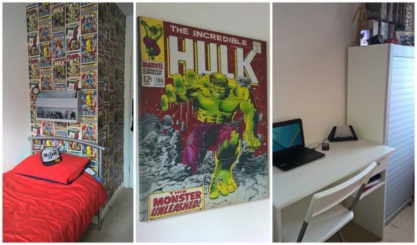
When we told Curly that we were planning on updating his room as part of International Wallpaper Week, we asked what sort of theme he wanted and what he would like to do with his room. He said that he would prefer white furniture to make it look brighter and he was keen to stick with red as an accent colour but he wanted to make more of his interest in DC Comics and found this fab wallpaper from Graham & Brown which features vintage style DC Comics imagery and he said he wanted a desk on which to do his schoolwork as well as storage which kept everything hidden away. I have to say I was really impressed with the quality of the wallpaper and had the whole job done in a little over an hour.
Update Furniture
Sadly we couldn’t afford to buy all new furniture for his room but with a bit of reshuffling around the house, we were able to move Curly’s old Ikea storage unit into the playroom and bring up a couple of the smaller Ikea storage units up from the playroom into his room. We bought a roll-front lockable storage unit from my sister to store all of his Lego creations in (to keep them safe from Jelly Bean’s meddling fingers) and then bought a new wardrobe and desk from Amazon.
Over the half term break whilst Curly was away with his Mum we pulled everything out of his room and I set to work on wallpapering the walls behind his bedroom door which were previously red. Hubby wanted to wallpaper the wall behind his wardrobe and desk but I asked Curly what he wanted and he said that he wanted to keep it white and just do the walls behind his bed and door.
Marvel Wallpaper
The wallpaper went up like a dream with very little waste at all. It was a thick paper which soaked up the paste nicely and was easy to manoeuvre once on the walls. I am pleased to say that it has dried without a single air bubble in sight and has really brought his room to life. It wasn’t until the paper was on the walls that we realised that the Hulk prints matched the large print which Curly already has on his bedroom wall so it brings the room together nicely. I’m now on the lookout for a smaller print with the matching Captain America imagery.

Upcycling
Above Curly’s bed he had a Tidy Books unit which was ideal to store his watch, phone, iPod etc but it didn’t look right in the light beech against the wallpaper so we sprayed it silver to match his bed and the roll-front on his Lego storage unit and the final piece of the puzzle came with a new aluminium Venetian blind.
Curly loves his new room and I’m really happy with the finished look. It looks clean, fresh and modern, the wallpaper offers a more grown-up feel to a ‘boys’ room yet still encompasses one of his great loves and the storage has meant that he is able to keep his bedroom much tidier.
Cost of the makeover:
Wallpaper £10 per roll – 1 roll used £10
Venetian Blind £22
Wardrobe £70
Desk £40
Secondhand Unit £30
Total cost of the makeover – £172
DISCLAIMER: We were given the wallpaper for the purpose of this post. All words, images and opinions are my own and may not be copied without my permission. I have not been instructed what to write.

