
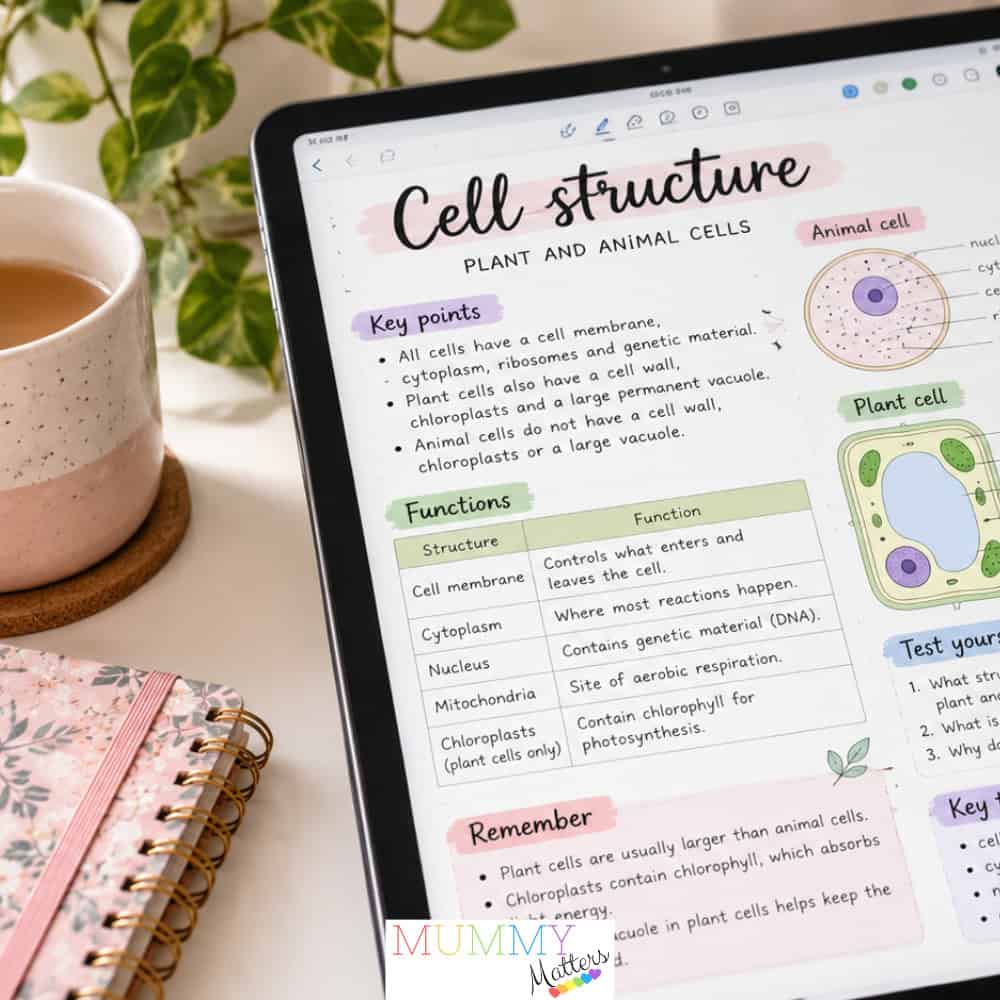
Aesthetic notes can be enjoyable to make and easy to return to. The problem begins when the design takes more attention than the material, or when a beautiful page is difficult to use during revision.
You do not have to give up colour, handwriting or a favourite template. A few changes can keep the visual style while making the notes more practical. Start with these common mistakes and the habits that can replace them.
Designing the page before understanding the topic
A blank page invites you to choose a palette, test a brush and adjust the title. That can become a long setup session before you have decided what the topic actually means.
Write a rough outline first. Identify the main question, the essential ideas and anything you do not yet understand. Once those are on the page, choose a layout that suits them.
For example, a comparison may work better in two columns than inside several decorative boxes. A sequence may need arrows and room for explanations. Let the content determine the design rather than squeezing every topic into the same attractive spread.
Giving every colour a different meaning each week
Colour can help distinguish information, but a changing code adds another thing to interpret. If blue means a definition on one page and a warning on the next, the appearance is doing little organisational work.
Start with dark body text and two accent colours. Give the accents simple jobs, such as questions and examples. You can still vary a cover page without changing the working system throughout the notebook.
Do not rely on colour alone. Labels, symbols and headings help when you print in greyscale, share a page or use a screen with different colour settings. Readability should survive a change of device.
Copying everything into neat boxes
A carefully copied slide can look complete while leaving you unsure how to explain it. The page records the source, but not necessarily your understanding.
After reading a section, look away and write its point in a few sentences. Then check the source and correct anything you missed. Use a box for that explanation rather than automatically copying the entire paragraph. This is one of several effective revision techniques worth practising, particularly when studying for A-levels or other important examinations.
Keep exact quotations distinct from your own words and include the source location. This is especially useful when notes later become an essay plan. Attractive formatting should not make it harder to tell an author’s claim from your response.
Filling every margin
Stickers, sidebars and extra captions can leave no space for later questions. When revision starts, you may need somewhere to add a correction or connect the page to another topic.
Leave some room deliberately. A margin can hold a question; a small space at the bottom can hold a summary. Neither needs to be filled during the first pass.
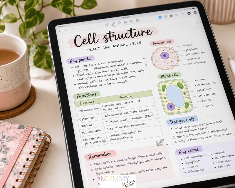
When browsing ideas for aesthetic digital notes, look for layouts with a clear heading hierarchy and space for review. Borrow the structure rather than trying to reproduce every visual detail. A template should save decisions, not create another project.
Choosing style over legibility
A pale heading may look soft on a bright tablet and become difficult to read in a lecture room. Very small writing can produce the same problem when the page is viewed at normal size.
Test a page without zooming in. Can you find the title, read a definition and distinguish an example quickly? Check the same page on any smaller device you use for revision.
Reserve elaborate lettering for short headings if you enjoy it. Use a straightforward style for explanations, formulas and references. Consistent spacing and clear labels usually matter more than making every line visually distinctive.
Using vague names for otherwise organised pages
A neat notebook can still be difficult to navigate if its pages are called “notes,” “lecture” or “week stuff.” Decoration does not solve that problem.
Use a predictable title containing the subject, topic and date or week. Keep related material together and create a simple contents page if your app’s navigation does not provide what you need.
Add links or tags only where they make retrieval easier. A small system you maintain is more useful than an elaborate structure abandoned halfway through term. Try finding a specific example from last month to see whether your organisation works.
Finishing the design without planning the review
A completed spread is not the end of the study task. Leave questions that give you a reason to reopen it and attempt an answer without looking.
For a diagram, hide the labels and explain the parts. For an essay topic, use the heading as a question and outline an answer. Check the result against your notes, then return to gaps in another session. Regular self-testing is also an important part of preparing for school exams, helping students identify which topics need more attention.
Finally, set a reasonable limit on styling time. If a design change does not improve readability or review, it can wait. Combining useful notes with a realistic GCSE revision timetable can also help students stay organised and avoid last-minute cramming. Keep the parts you enjoy, simplify the rest and let the page’s usefulness matter more than whether it looks ready to post online.