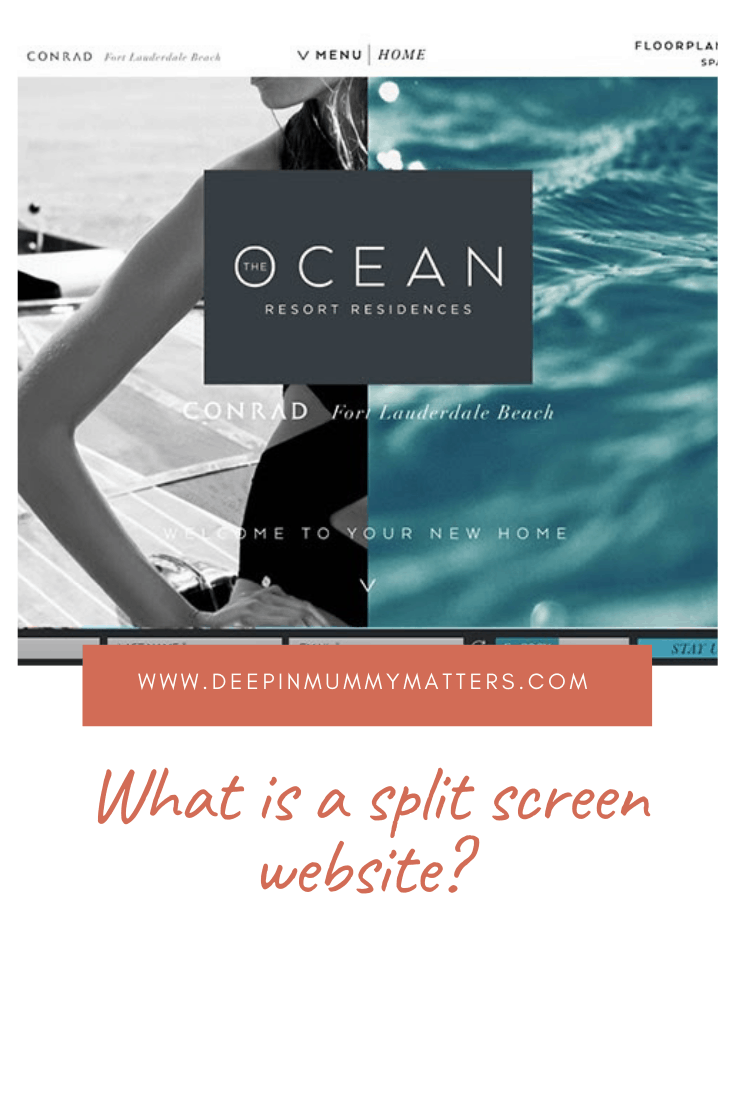
Recently, more and more often, you see split screen website designs, where the division of the screen characterises into two or more parts. What can we say? It looks unusual and quite interesting. But is it really that good, and is it always appropriate? Today we will figure out what are the advantages of such a design. How to use it effectively. And what examples of application can be considered the most successful.
What is a Split Screen Website
This is a division of the screen into several parts, usually two. But it is important not to think of this technique as a grid structure. Since in split-screen designs, screen fragments are larger and are placed along the entire vertical. Thanks to this solution, you don’t have to worry about highlighting the main information. Without scrolling and links to third-party sites, the visitor will learn everything important in a split screen website template.
The advantages of this design technique are the following:
- non-typical approach to website design, which has not yet bored users;
- contrasting content placement technique has a better effect on customers;
- the ability to emphasise an important element – a logo, a call to action button, a unique selling proposition (USP), price, and more.
The main rule of “split” content is that there should be two messages on one screen. They are not necessarily both verbal. That is, the vertical screen acts as an independent page with images, text publications and buttons.
Split screens are more effective when the user is given a choice. For example, you can offer your client two services: for commercial use and personal use. When the screen is divided into two different parts, the clients are more motivated for navigation and future-making of decision.
First variants looks like symmetrical parts. But now there are a lot of other much more interesting solutions.
For example, the trend patterns with zigzag separation. As well as designs where one part is larger than the other. Another option that will help you decorate your site is the placement of content unevenly—for example, a picture in one part and text in another.
Split screen and mobile devices
A significant drawback of the split-screen design is sometimes incompatibility with gadgets such as mobile phones and tablets; it is displayed in an ugly way. To make the template suitable for mobile devices, you need to try it seriously. Except that tablets in landscape mode will not present an inconvenience, everything looks correct there.
In most cases, you have to make various elements and details smaller in size; this should be taken into account when coding. So before you start experimenting and create an original split-screen design, be sure to consider the option with mobile devices with https://fireart.studio/hire-professional-ui-developers/.
Split design use cases
By creating a split design, you can focus your visitors’ attention on two important pieces of content while giving the client the ability to choose what interests him more independently. However, it is important to understand that the screen parts must be interconnected so that the potential client does not puzzle over the meaning. So here are some interesting ideas for inspiration.
A mix of vibrant colors and interesting typography
Since minimalist flat designs are trendy today, saturated colours and typographic elements become decisive and catchy. Bright shades attract attention and promote quick assimilation of information. At the same time, high quality makes a more clear message. Together, these design components create an interesting pattern.
The split-screen design will come in handy to make the button that invites the visitor to take some action even more visible. A large amount of free space and an additional vertical line help draw the visitor’s attention to the significant area.
Think of a split screen like a business card
At its core, split design has emerged as a kind of business card on the Internet. Indeed, the split screen can be used as an enlarged card. Each part includes its own message for the visitor: a photo, a call to action, a description, and so on. The main advice is to stick to a minimalist style since a pile of various elements in one place will create a feeling of chaos and bad taste.

